

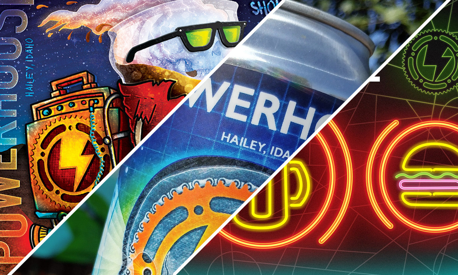
Powerhouse "To-Go" Beverage Series (V. 1–3)
-
Client: Power House Restaurant & Bike Repair
-
Location: Hailey, ID
-
Roles: Illustration, Graphic Design, Creative Strategy
-
Scope: Recurring Product Packaging & Brand Evolution
-
Medium: Analog Ink, Pencil, Digital Color & Typography, Vector Art
Creative Lead
I was retained over a three-year period to develop a visual "To-Go" identity for one of the Wood River Valley's most iconic establishments. Because Power House is a hybrid of high-end gastronomy and rugged bike culture, the packaging needed to be versatile enough to appeal to both. My role as the creative lead involved:
Strategic Brand Continuity: Developing three distinct "Volumes" that reinvented the brand's aesthetic while maintaining core recognition through the use of the signature lightning bolt and mechanical motifs.
Packaging UX & Functionality: Integrating technical "bartender-friendly" features, such as glassware-check grids and beer-style zones, directly into the artwork.
Mixed-Media Mastery: Transitioning from hand-drawn graphite textures and "Combat Rock" homages to clean, scalable vector graphics for year-round consistency.

Vision
The mission was to translate the restaurant's three pillars—Bikes, Burgers, and Beers—into a mobile brand. For Vol. 1, the focus was "Mechanical/Technical" (x-ray schematics); Vol. 2 shifted to "Culture/Music" (the Joe Strummer homage); and Vol. 3 solidified the "Landmark" (the storefront neons). This progression kept the brand fresh for local "regulars" while providing a collectible series for visitors.

Creative Strategy
Managing a brand over several years requires the ability to innovate without losing the original "spark." I led the creative direction for each version by identifying specific cultural hooks—like the "Should I Stay or Should I Go?" tagline—that resonated with the "to-go" nature of the product. This approach proved that art can be a powerful tool for driving recurring sales and building brand equity.

Version 2 / Homage to Joe Strummer of the Clash
Human Element
These labels are a tribute to the "Back-of-House" culture. Having worked within these walls, I knew the music and the grit that defined the brand. Each design was vetted by the staff and the community, ensuring that when a can left the restaurant, it carried a piece of the authentic Power House soul with it.

Process
Developed from full-scale pencil sketches, this volume leaned into the rock-n-roll history of the restaurant, utilizing a grit-heavy, hand-drawn style to celebrate the "Combat Rock" ethos of the staff.

Version 1 / Tools of the Trade
Tools of the Trade
This design introduced the glassware grid, allowing for operational efficiency at the bar. It merged mechanical bicycle schematics with a "human-first" anatomy motif.
