

"Hailey Alive" Music Series Branding
-
Client: Sawtooth Brewery
-
Location: Hailey, ID
-
Roles: Illustration, Graphic Design, Creative Strategy
-
Scope: Multi-Year Event Visual Identity / Poster Series
-
Mediums: Analog Graphite, Watercolor, Digital Color & Typography
Creative Lead
I was tapped by Sawtooth Brewery to develop the inaugural visual identity for their "Hailey Alive" summer music series at Hop Porter Park. The project required a design that captured the local spirit of the Wood River Valley while being versatile enough for multi-channel promotion. Key responsibilities included:
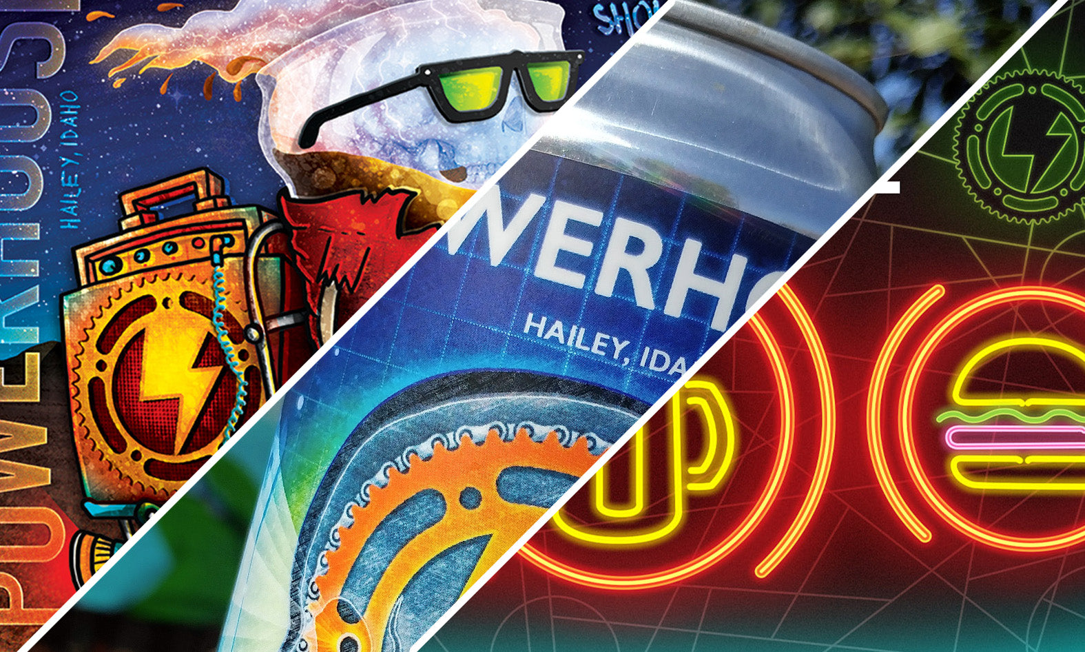
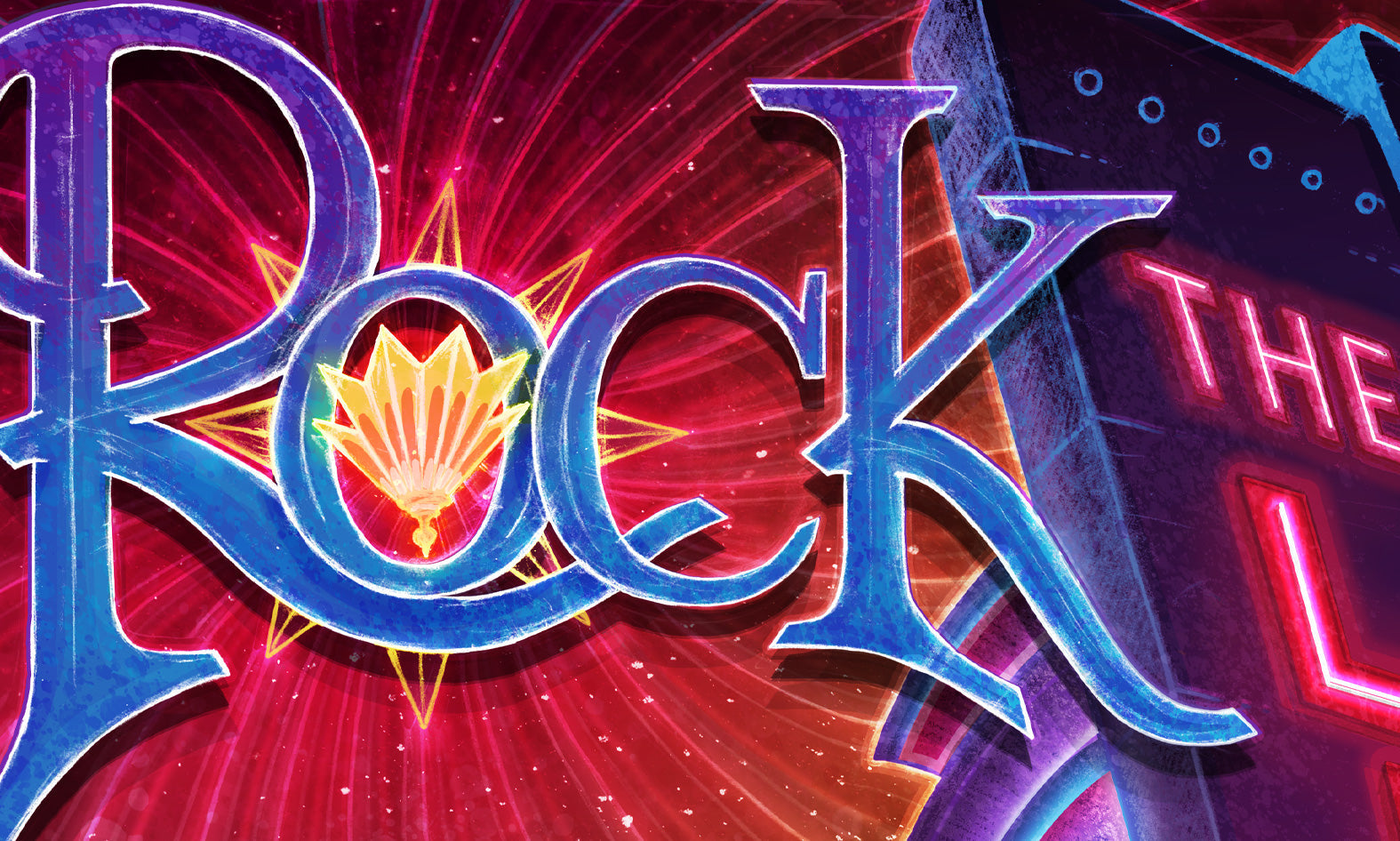
Strategic Rebranding: Following a successful first year, I worked with the client to transition the series to "Hailey Rocks." This move was a strategic decision to differentiate the event from neighboring series and establish a unique local brand.
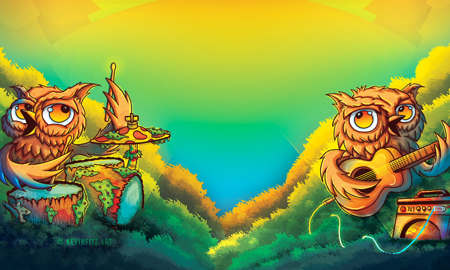
Narrative Illustration: Developed a recurring character set (the Great Horned Owls) to act as "brand ambassadors" for the series, creating a recognizable visual hook for the community.
Mixed-Media Production: Integrated traditional watercolor washes with digital typography to create a "modern-rustic" aesthetic that aligned with the brewery’s brand identity.

Vision
Hop Porter Park sits on the edge of the Big Wood River, where the local Great Horned Owls are a constant presence. My goal was to give those owls a "voice" by depicting them as a two-piece rock band perched in the cottonwoods. It was a playful way to signal that the woods were coming alive with music, bridging the gap between Hailey's natural beauty and its vibrant summer social scene.

Leadership & Adaptability
Great design should be an asset, not an expense. When the series needed to pivot its name in year two to avoid market conflict with "Ketchum Alive," the strength of the original illustration allowed for a seamless rebrand. I managed the layout adjustments and typography updates to ensure "Hailey Rocks" maintained the momentum and "fan-favorite" status of the previous year.

Analog Foundation
The poster design began with hand-drawn line work and light watercolor washes to provide a organic, textured base that digital-only art often lacks.
Final coloring and typography were handled digitally, allowing for the quick pivots in naming and scheduling required for a recurring concert series.