

"Big Wood Balm" Product Packaging & Brand Identity
-
Client: Big Wood Balm
-
Location: Hailey, ID
-
Roles: Illustration, Graphic Design, Creative Strategy
-
Scope: Full Brand Launch (Logo, Packaging, Event Assets)
-
Mediums: Hand-drawn Illustrations, Digital Color & Typography
Creative Lead
I partnered with an independent apothecary to build a cohesive visual identity from the ground up. My role was to translate the raw, healing power of wild-harvested ingredients—cottonwood buds and arnica flowers—into a professional, retail-ready brand. This project required a versatile design system that could scale from tin labels to large-scale event tapestries and social media assets.

Vision
This project was born out of a passion for local, sustainable products. Having seen the process—from harvesting the cottonwood and arnica buds to the final pour—I felt a responsibility to ensure the visual identity was as high-quality as the product itself. The resulting brand is a tribute to the craftsmanship and healing spirit of the Wood River Valley.

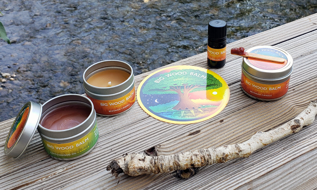
Tree of Life
At the heart of the brand is a custom "Tree of Life" illustration. This piece was designed to be the primary brand asset, representing the deep roots and vibrant growth of the Wood River Valley. By utilizing intricate digital line work, I created a signature graphic that functions as both a standalone art piece and a recurring brand watermark.


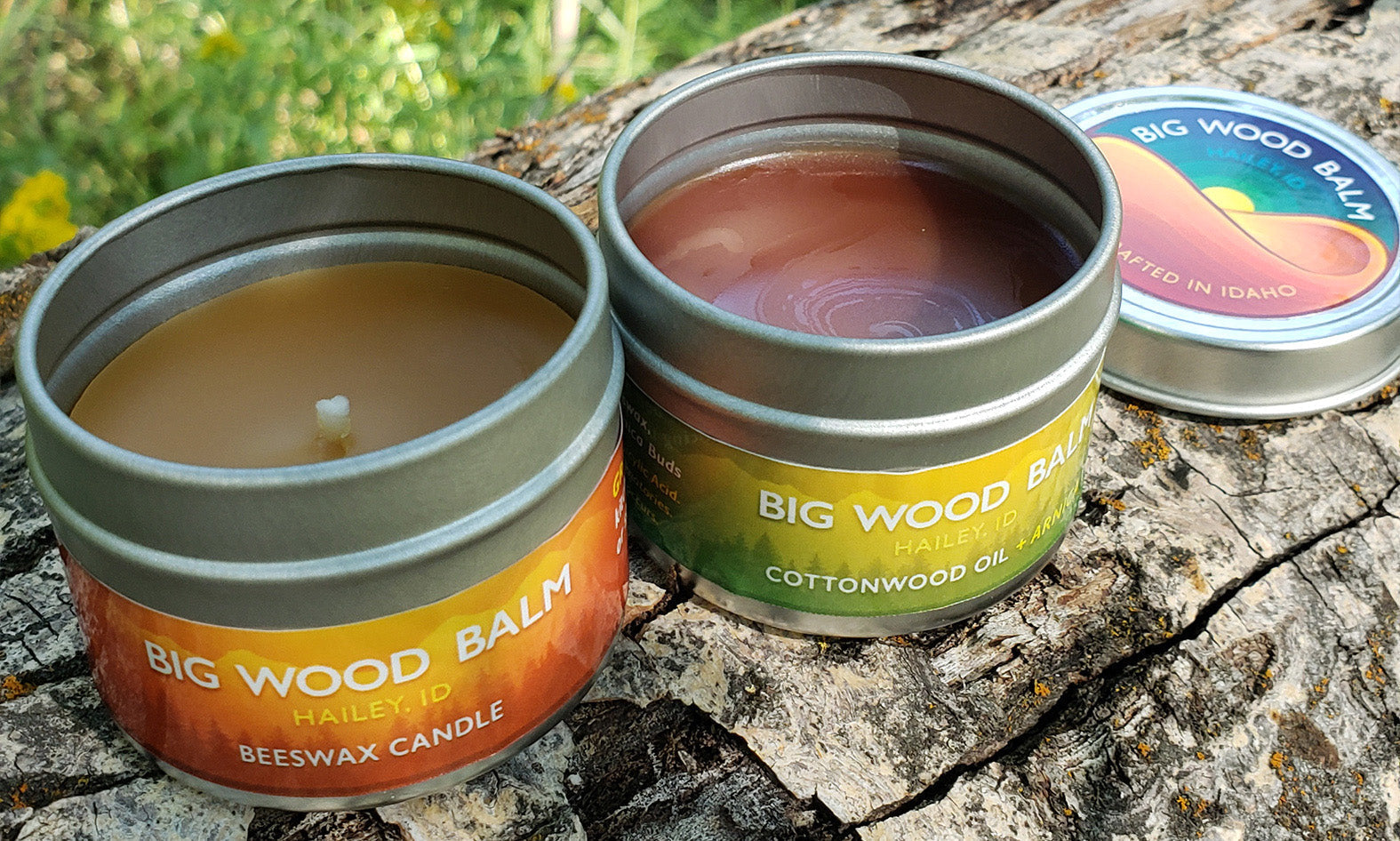
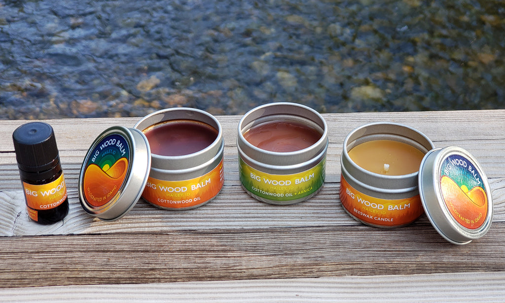
Packaging Design
Moving from art to application, I developed the technical layouts for the balm and candle lines. Balancing botanical illustrations with clean typography ensured the ingredients remained the hero of the packaging.
I established a color-coding system that allowed customers to easily distinguish between the cottonwood and arnica formulas while maintaining a unified "family" look on the shelf.

Brand Identity
I designed the Big Wood Balm logo to bridge the gap between a "handmade" artisanal feel and a sophisticated commercial product. This involved custom typographic treatments that feel grounded and organic, ensuring the brand stands out in a competitive independent market.
The logo design reflects the fluid, restorative nature of the product itself. By utilizing organic, flowing linework, the identity mirrors the smooth consistency of the cottonwood balms while maintaining the structure of a premium apothecary brand.


%0A%0A%0A%0AMediums:%20Hand-drawn%20Illust...)