

Article: "Rock The Liberty" Music Series Branding
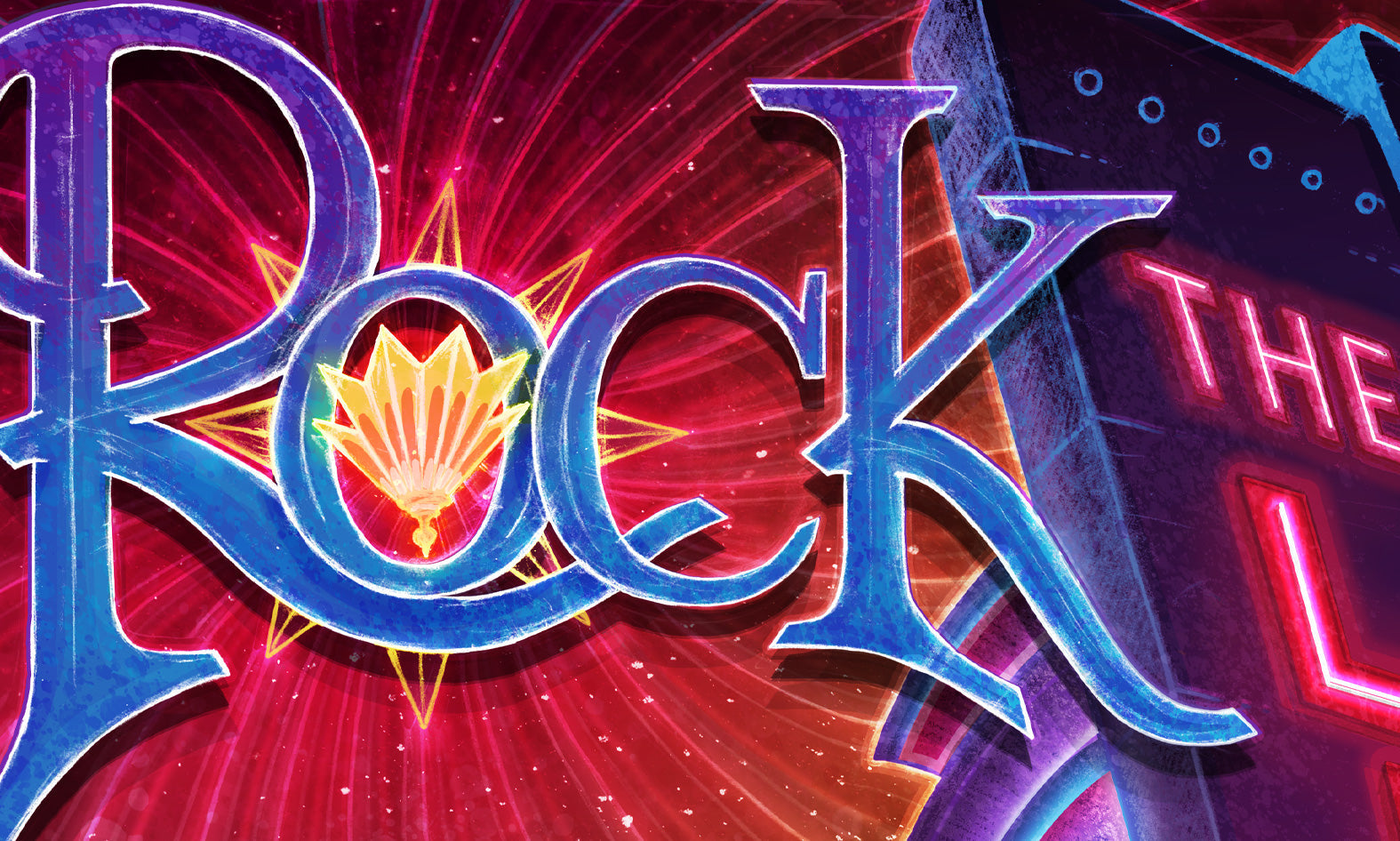
"Rock The Liberty" Music Series Branding
-
Client: The Liberty Theater Company
-
Location: Hailey, Idaho
-
Roles: Illustrator, Brand Designer
-
Scope: Event Series Visual Identity / Architectural Illustration
-
Medium: Analog Graphite, Digital Color
Creative Lead
I was commissioned to create a flagship visual identity for the "Rock The Liberty" live music series. This project was a key component of the theater's reopening strategy following the successful "Relight the Liberty" community campaign. My role involved:
Architectural Storytelling: Using the theater’s iconic 1938 Art Deco facade as the primary narrative element to celebrate its survival and return as a community hub.
Mixed-Media Execution: Combining traditional hand-drawn graphite textures with modern digital coloring to bridge the gap between the venue's historic roots and its future as a modern music space.
Hand-Drawn Typography: Designing custom lettering to ensure the poster felt like a cohesive, singular piece of art rather than a template-based design.

Vision
The Liberty Theater is the crown jewel of Main Street in Hailey. After the doors were closed for several years, the "Relight the Liberty" campaign brought the community together to save this landmark. My goal was to put those infamous neon lights on full display—representing the physical "spark" that brought live music back to this stage.

Creative Strategy
A music series poster has to do more than list dates; it has to capture an atmosphere. By focusing on the architecture and the warm glow of the neon, I created a visual anchor that the theater could use to re-establish its brand in the Wood River Valley. This project required a deep understanding of local sentiment and the importance of heritage in downtown Hailey.

Human Element
There is something special about seeing those neon lights on at night again. This illustration was my contribution to that momentum. It serves as a tribute to the volunteers, donors, and fans who refused to let this iconic venue go dark.

Hand-Drawn Details
Initial sketches were created with graphite on paper to capture the gritty, historic texture of the 1930s masonry, then brought into a digital environment for vibrant "neon" coloring.
Custom typography was integrated into the illustration to maintain a handcrafted, "Human-First" aesthetic that mirrors the community-driven nature of the theater itself.