
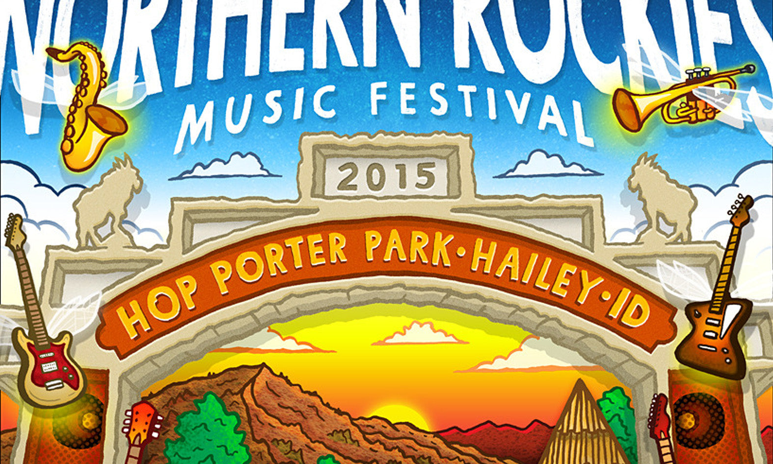
"Northern Rockies Music Festival" Event Identity
-
Client: Northern Rockies Music Festival (38th Annual)
-
Location: Hop Porter Park (Hailey, ID)
-
Roles: Lead Illustrator, Typography Specialist, Creative Lead
-
Scope: Comprehensive Festival Identity, Spatial Information Architecture
The Challenge
A landmark regional music festival celebrating its 38th consecutive year required a comprehensive flagship visual identity system to anchor its multi-channel promotional campaign. The primary design hurdle was managing extreme information density—synthesizing a massive, multi-artist lineup with regional landscape motifs into a single, cohesive promotional panel. The client demanded a versatile design framework that could maintain absolute legibility at small digital formats while scaling into a high-impact physical footprint.

The Strategy
Spatial Framing & Information Architecture: Engineered a sophisticated visual layout using the park’s landmark architectural entrance arch as a primary structural framing device. This design choice directed the viewer's eye through a clear visual hierarchy, seamlessly transitioning from high-energy creative illustration to dense, technical typographic data.
High-Volume Typographic Layout Management: Developed a rigorous typographic grid system to organize the extensive artist lineup. By meticulously managing font weights, tracking, and spatial intervals, I ensured maximum legibility across all print and digital channels, preventing visual clutter while maintaining the brand's premium identity.
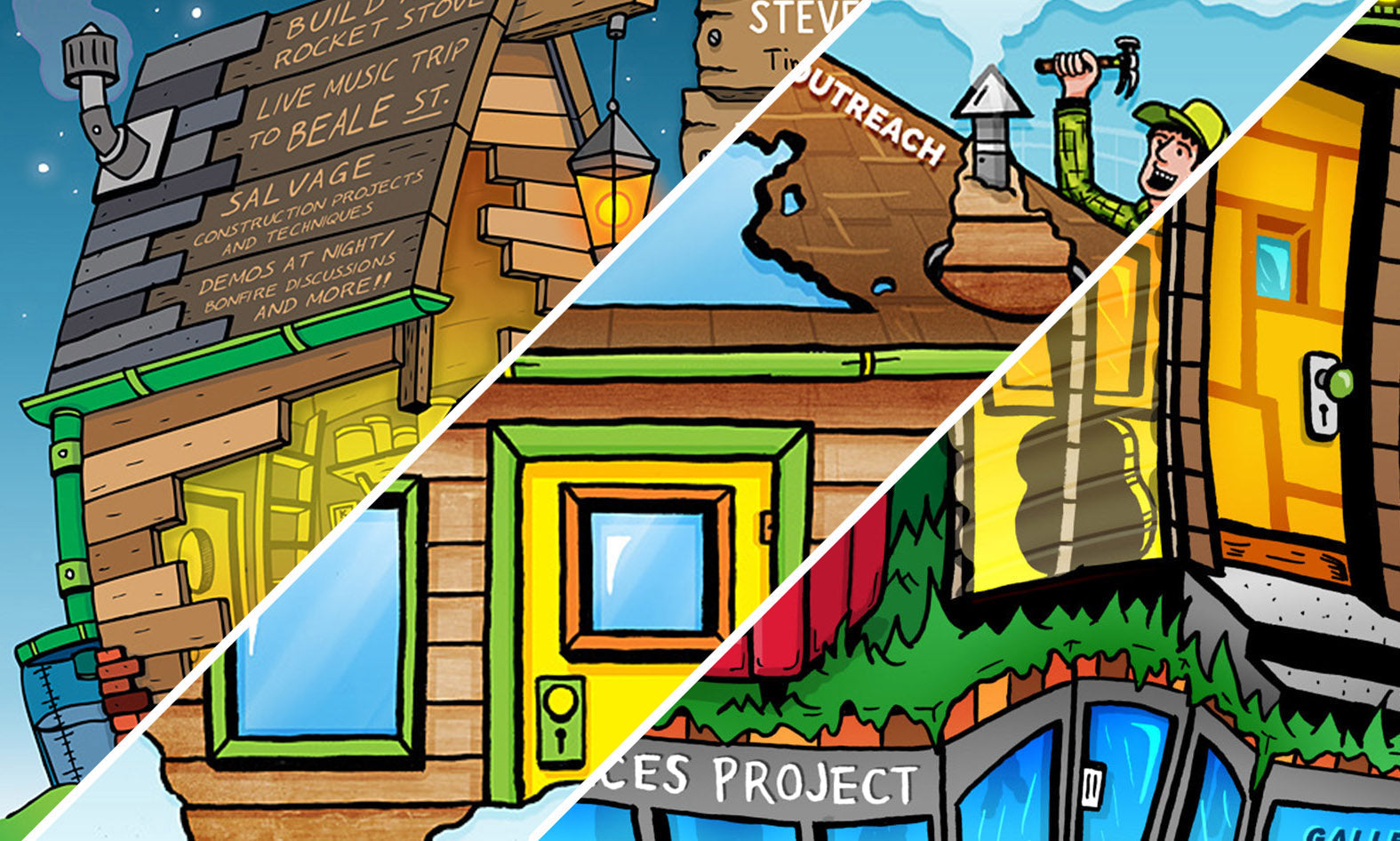
Hybrid Scalable Production: Orchestrated a process-driven workflow starting with intricate, hand-drawn traditional ink-on-paper textures to capture an authentic regional aesthetic. These assets were then migrated into a high-vibrancy digital environment, allowing for rapid layout modifications, text updates, and multi-platform color grading.

The Impact
Delivered a high-performance visual signature that successfully anchored the 38th annual festival across all digital, print, and onsite channels. The clear information architecture minimized consumer friction, maximized brand recognition throughout the region, and provided the organization with a durable marketing asset that honored its long-standing cultural legacy while driving ticket conversions.


%0A%0ALocation:%20Hop%20Porter%20Park%20(Hailey,%20ID)%0A%0ARoles:%20Lead%20Illustrator,%20Typography%20Specialist,%20Creative%20Lead%0A%0AScope:%20Comprehensive%20Festival%20Identi...)